

So when architect Nicholas Potts took on the challenge of uniting two apartments into one sweeping, 3,000-square-foot residence, the result was always going to be more than just another luxury renovation. It’s a love letter to modern design and a debut moment for the designer-architect, who recently relocated from New York to Washington, DC, and found himself starting fresh on a very storied stage.
Photography by Chris Mottalini with styling by Tessa Watson
When I saw the photography had been published, I reached out right away, and Nicholas generously offered me a personal tour. The space is a marvel: five types of stone across walls and patterned floors, all unified into a home that’s distinctly singular. The biggest flex? It’s a one-bedroom formed from two units. The owner built a little shrine to live in, while the rest of us admire it from afar.
Afterwards, we spoke more about his process, and what it means to design with reverence for the past while carving out something entirely original. Here is an excerpt from our conversation:
Afterwards, we spoke more about his process, and what it means to design with reverence for the past while carving out something entirely original. Here is an excerpt from our conversation:

Photography by Chris Mottalini with styling by Tessa Watson

“I think a lot of people know the name Watergate, but wouldn’t be able to pick the building out of a lineup,” Nicholas told me. “They have no idea that the Vatican helped develop it, or that Luigi Moretti was the architect, or that it was the first Planned Unit Development in DC.”
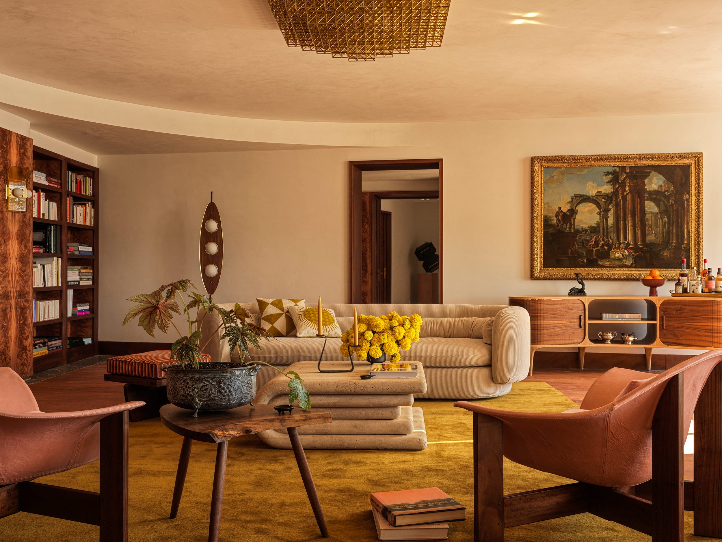
This commission offered Nicholas a rare opportunity to bring together the many threads of his career to date. Lessons from formative experiences like his large architectural projects, contributing to OMA’s Elements of Architecture exhibition at the 2014 Venice Biennale, or producing research-heavy “Walking Tour” videos for Architectural Digest, have all found their way into the design. The result is a cohesive expression of his studio’s emerging aesthetic: historical thinking without resorting to pastiche, confident in its use of exceptional materials, and realized through close collaboration with skilled artisans.
This commission offered Nicholas a rare opportunity to bring together the many threads of his career to date. Lessons from formative experiences like his large architectural projects, contributing to OMA’s Elements of Architecture exhibition at the 2014 Venice Biennale, or producing research-heavy “Walking Tour” videos for Architectural Digest, have all found their way into the design. The result is a cohesive expression of his studio’s emerging aesthetic: historical thinking without resorting to pastiche, confident in its use of exceptional materials, and realized through close collaboration with skilled artisans.
Photography by Chris Mottalini with styling by Tessa Watson
The idea behind the residence, from the start, was to bring the building forward as an artifact. “We spent a lot of time, before pencil hit paper, researching the building and understanding its language. Here, it was the curved geometry - from the plan to the details on the exterior - that really wanted to tell a story.”
The result is a bold, materially rich interior that’s less a luxury pied-à-terre and more of a marble-wrapped one-bedroom with a dedicated office and one sprawling dressing room.
The result is a bold, materially rich interior that’s less a luxury pied-à-terre and more of a marble-wrapped one-bedroom with a dedicated office and one sprawling dressing room.
Photography by Chris Mottalini with styling by Tessa Watson
Of course, combining two units wasn’t without its spatial challenges. “In buildings like this, plumbing and mechanicals are king,” he explained. “Earlier renovations had tried to cheat the infrastructure, which left behind strange soffits and awkward, unusable spaces. Our approach was to reset everything, return the systems to their logical places, simplify, and then layer in moments of punctuation with vestibules and transitions.”
Photography by Chris Mottalini with styling by Tessa Watson
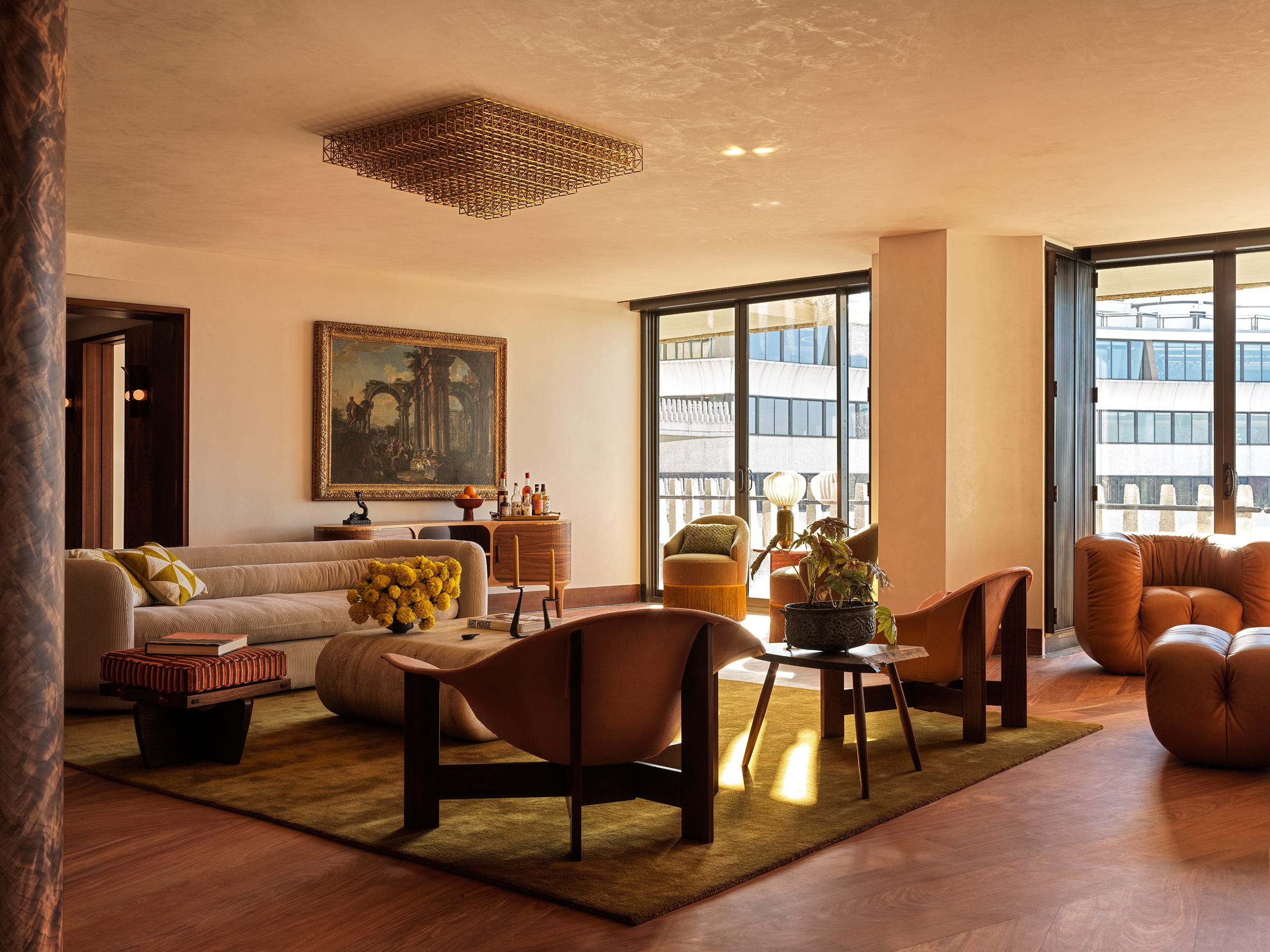
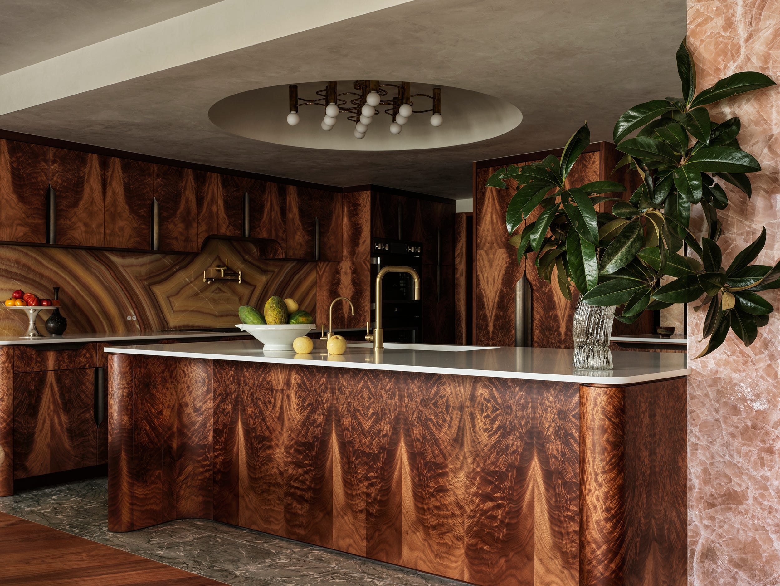
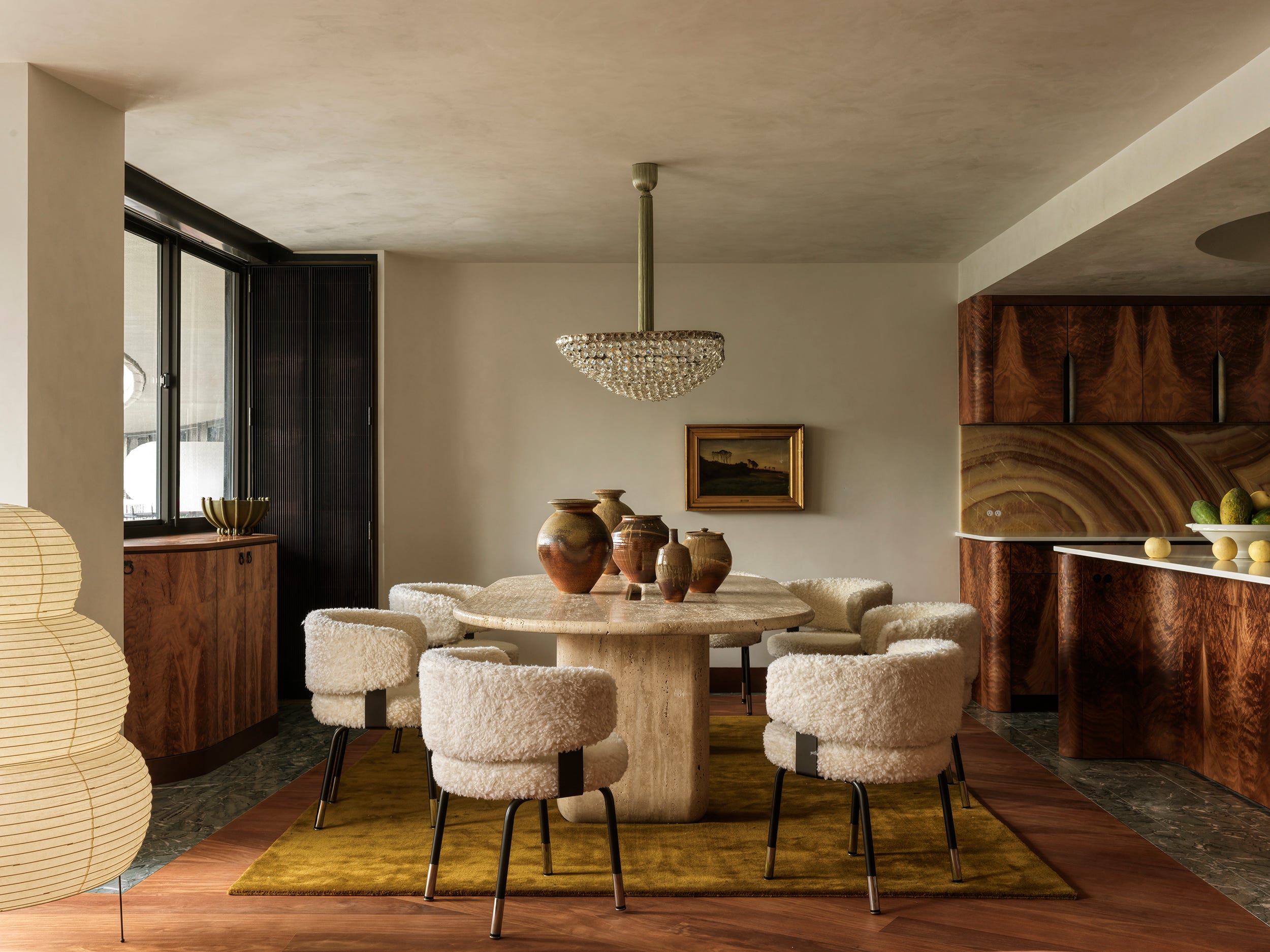
Then there were the surfaces. Luxurious doesn’t quite cut it, but somehow the interiors still feel composed. “We thought a lot about restraint,” Nicholas said. “That Coco Chanel quote about taking one thing off before you leave the house was very much a guiding principle. The materials needed to breathe. We used burnished plaster as the backdrop and let the details sit with intention. Borders, reveals, edits… it was all about clarity.”
Despite the opulence, the goal was comfort. “We wanted the space to feel amazing for entertaining, especially during the sunset hour, but it had to feel calm when it was quiet. Comfortable in its own skin.”
“Our approach to furnishings is to look at craftsmanship and artistry, rather than a particular style, and we take a similar approach to whether we are sourcing new or vintage items. At Watergate, we purchased the Sciolari lamps very early in the project via 1stDibs, as well as the fringed Dimore chairs at auction, and started to build a collection of new and vintage pieces around the mood these items set.”
While Mies van der Rohe and the Viennese Secession provided clear starting points, Nicholas also drew inspiration from the 1970s and the early 20th-century designers who were often reinterpreted in that era. Echoes of Piero Portaluppi, Jean-Michel Frank, and even Eltham Palace surface subtly throughout the space.

A circular bathroom leads into a bedroom-sized walk-in closet
![big photo]
(https://media.architecturaldigest.com/photos/681a64f2e0d41c4ec81bd0c5/master/w_1600,c_limit/NicholasPotts_Watergate_6992_version.jpg)
Photography by Chris Mottalini with styling by Tessa Watson
Photography by Chris Mottalini with styling by Tessa Watson
Though the studio avoids cultivating a fixed signature style, certain gestures reappear across projects. In the Watergate interiors, those moves are especially evident in the central hall: a strong horizontal datum just below the ceiling line, filleted corners, axial views, and unexpected patterns used to guide the eye and create rhythm.

Photography by Chris Mottalini with styling by Tessa Watson
As his first major commission in Washington, D.C., Nicholas saw an opportunity to reframe how the city is understood aesthetically and architecturally. While the capital is often cast in a tired binary between traditionalism and modernism, that narrative misses the depth and diversity of its built environment and the people who shape it.
Rather than engaging with external expectations, Nicholas and his studio looked inward, letting the site guide the process. What emerged doesn’t conform or rebel; it speaks in its own distinct design language.
Rather than engaging with external expectations, Nicholas and his studio looked inward, letting the site guide the process. What emerged doesn’t conform or rebel; it speaks in its own distinct design language.

Photography by Chris Mottalini with styling by Tessa Watson

Potts used five types of stone across walls and patterned floors


